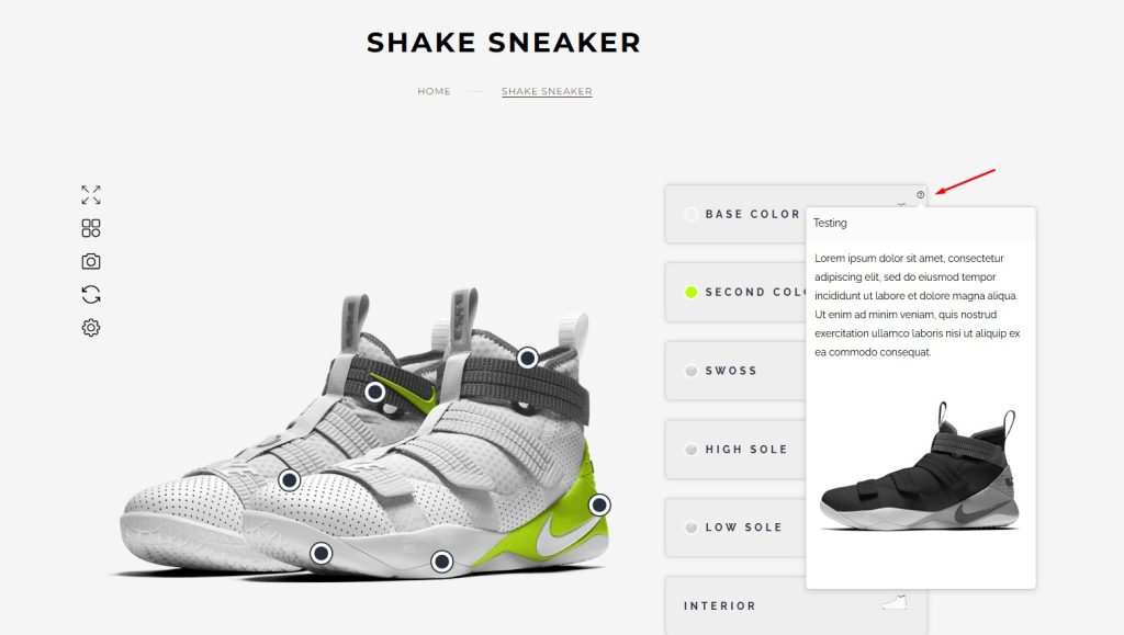
The Tooltip (or Popover) feature allows you to display additional information, images, or descriptions when customers interact with specific product layers. This enhances the product customization experience by providing context and guidance.
Prerequisites
-
The latest version of the Configurator Plugin is installed.
-
A configured product with layers (e.g., colors, straps, soles)
Step 1: Enable the Tooltip Feature
-
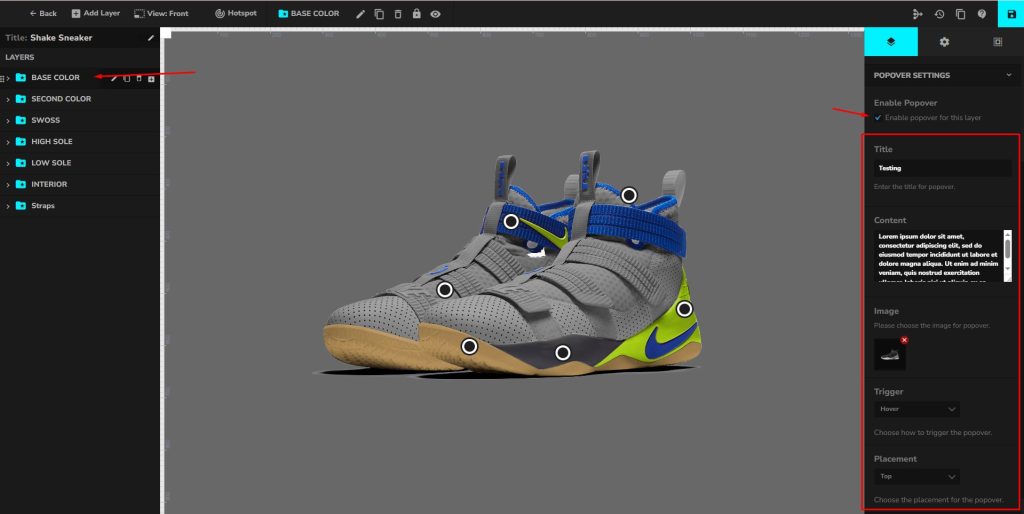
Go to the product configurator editor.
-
Select the layer you want to apply the tooltip to (e.g., Base Color, Interior, Straps).
-
In the Popover Settings panel, check Enable Popover for this layer.
Step 2: Configure Popover Content
-
Title: Add a short label for the tooltip (e.g., “Base Color Options”).
-
Content: Enter descriptive text or product details.
-
Image: Upload an image to display inside the tooltip.
Step 3: Set Popover Behavior
-
Trigger: Choose how users will open the tooltip. Options include:
-
Click (recommended for clarity)
-
Hover (quick previews)
-
-
Placement: Define where the tooltip will appear relative to the layer. Options include: Top, Bottom, Left, Right.
Step 4: Save and Preview
-
Save your configurator settings.
-
Open the product configurator on the front end.
-
Hover or click on the hotspots to see the tooltips in action.