
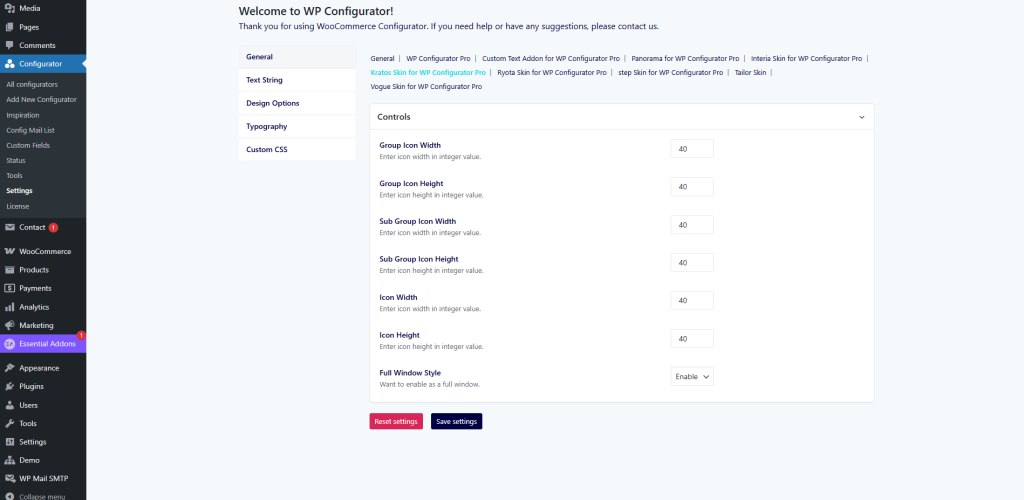
General Settings
Here you can control the main configurator panel and its layout behavior.
-
Group Icon Width / Height – Set the dimensions (in px) of the main group icons.
-
Sub Group Icon Width / Height – Define the size for sub-group icons for better alignment.
-
Icon Width / Height – Configure the overall size of the option icons.
-
Full Window Style – Choose whether to enable the configurator in full-window mode for an immersive product display.
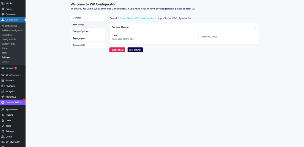
Text Strings
This section lets you customize labels and button texts to better match your brand language.
-
Control Header Title – Enter the main title for the configurator control panel (e.g., “CUSTOMIZATION”).
-
Replace default system text strings with your preferred terms (useful for localization or branding).
Design Options
The Design Options tab controls the colors and visual style of your configurator.
-
Control Background Color – Set the background color of the main control panel.
-
Control Background Box Shadow – Add shadow to create depth and contrast.
-
Title Color – Define the text color for section titles.
-
Product Title Color – Customize the font color of product titles.
-
Control Trigger Background Color – Adjust the background of trigger buttons.
-
Control Trigger Background Icon Color – Set the icon color for triggers.

Typography
Manage the font family, sizes, and styles used across the configurator interface to ensure brand consistency.
Custom CSS
For advanced styling, you can add your own CSS rules. This gives you complete control over the look and feel of the Kratos Skin.