General Settings
In the General tab, you define basic layout and icon sizing for Ryota Skin:
- Group Icon Width / Height — set the dimensions for main group icons in integer values (e.g. 40 × 40).
- Sub Group Icon Width / Height — set the dimensions for subgroup icons.
- Icon Width / Height — dimensions for general option icons.
- Full Window Style — toggle between standard panel mode and full-window immersive mode.
These control how compact or expansive your controls appear, and whether the configurator takes over the full viewport.

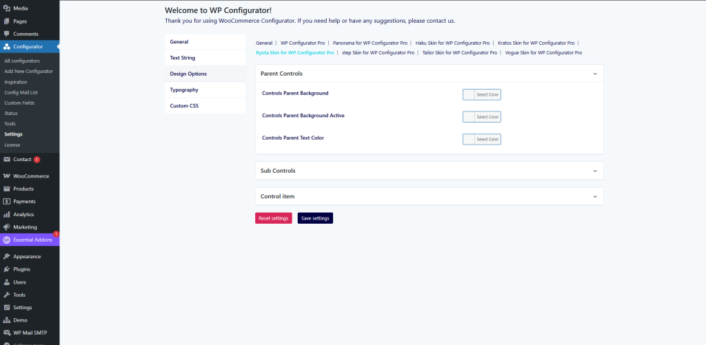
Design Options
This tab allows styling of parent controls, sub-controls, and individual control items:
Parent Controls
- Controls Parent Background — background color of parent control containers.
- Controls Parent Background Active — highlight color for active parent item.
- Controls Parent Text Color — text/icon color for parent controls.
Sub Controls
- Style the sub-control elements (when a parent group is expanded) — background, text, borders, etc.
Control Item
- Customize individual option items (padding, hover styles, border colors, etc.)
These settings allow you to harmonize the UI look and feel with your brand identity, especially for technical layouts.
Typography & Custom CSS
- Typography tab: Choose fonts, sizes, weights for headings, labels, descriptions, making sure the text legibility fits your branding.
- Custom CSS tab: Insert CSS overrides or advanced styling tweaks that go beyond the default theme settings.