Follow these quick steps to help you get started with Custom Text Add-on:
1. Set Up the Label and Placeholder
- Step 1: Navigate to Configurator Editor.
- Step 2: Add a descriptive label for the custom text field (e.g., “Enter your text”).
- Step 3: Set a placeholder text to guide users (e.g., “Your custom text here”).
- Optional: Choose the Active on Page Load option if you want the text field to be visible by default when the configurator loads.

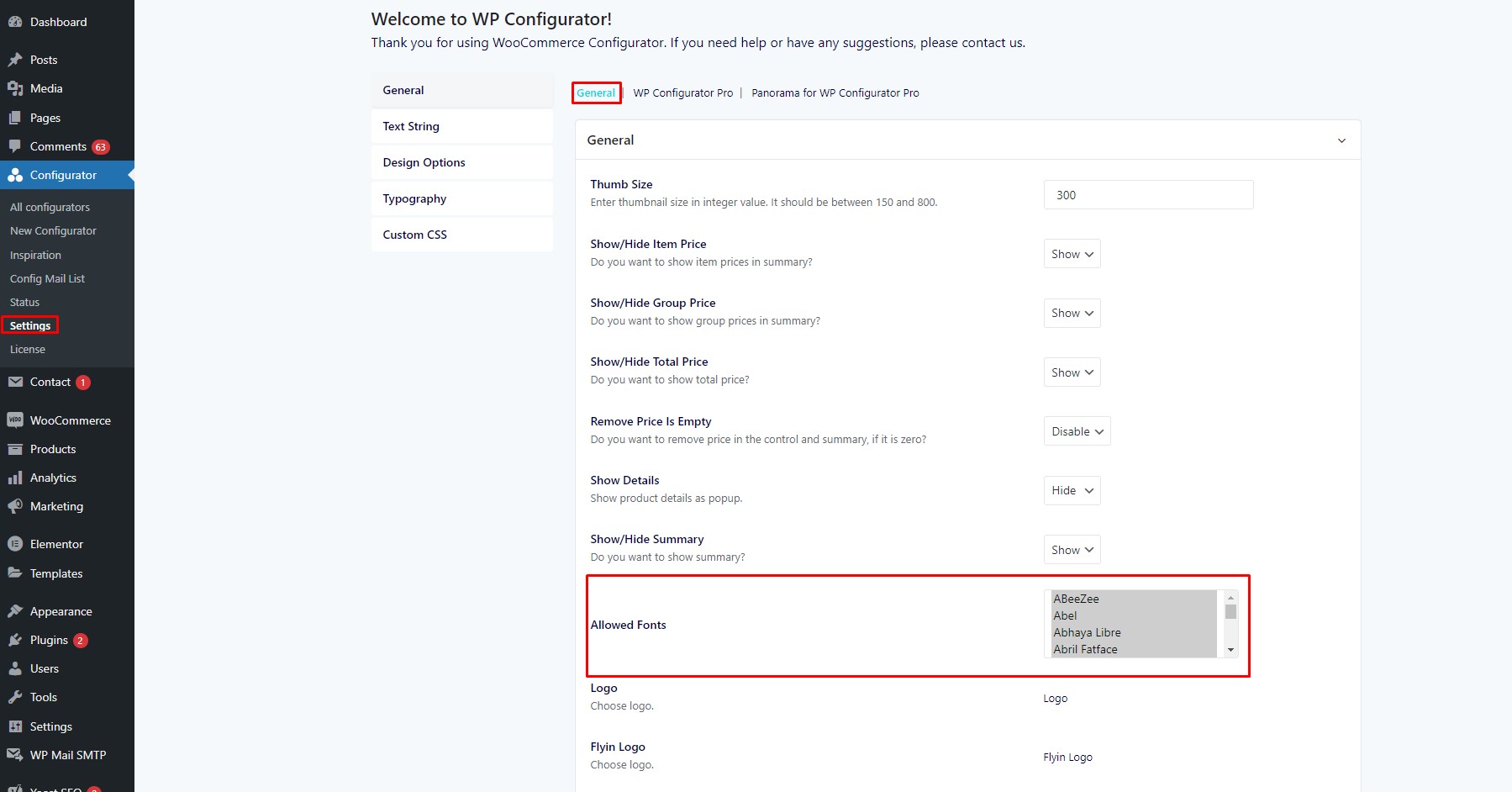
2. Choose Allowed Fonts
- Step 1: In the Configurator Settings, go to the General>Allowed Fonts section.
- Step 2: Select the fonts you want to make available for users to apply to their text.
- Step 3: Click save to apply changes.

3. Set Which View(s) to Display the Text
- Specify which product view(s) the text will appear on (e.g., Front, Back, Left, Right).
A closer look to custom text addon elements
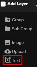
Inside your Configurator Editing Panel, you will initially notice the option when you hover on “Add Layer” then just choose “Text” layer.
Before adding the text, you must add the product image/image layer of your choice then you can proceed customizing it with the add-on.
Clicking the text layer you added recently, this will display more options on the right side of your browser. Let’s check the new features:
- Layer Type – Determines what type of layer in the configurator is added. You can simply switch layer by choosing according to what layer you want.
- Control Settings – These displays all the options needed on creating a text layer. The settings contain the following:
- Control Icon – You can choose your desired icon for the text layer. This will appear on front-end.
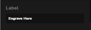
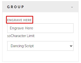
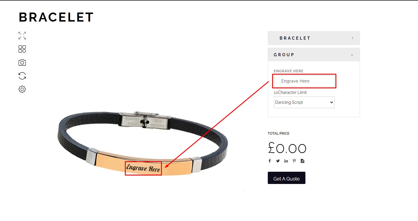
- Label – Input label is also available for this feature.
-
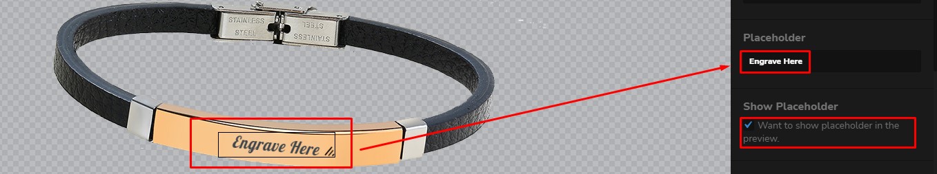
- Placeholder – If you want your placeholder text to be display while you’re editing on configurator editor, you can input the placeholder in the textbox. Also, if you want the placeholder to be present in the front-end you can just ‘tick’ the box below indicating “Want to show placeholder in the preview.”
-
- Character Limit – It is so important to set the character limit in every text so that the longevity of the text won’t ruin the design or the layout of the image. For example if you have small space or small part of the images that you want to have a custom text in it, there should be 5-6 character limit so that your text won’t overlap the image.
Example product that fit to use character limit:
-
- Customize Ring
- Customize Pin
-
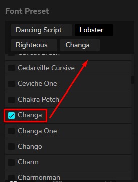
- Font Preset – Lots of varieties of the font family can be selected under this option. You must first select all fonts from the configurator settings. Here’s how to add the font preset:
- Go to Dashboard > Configurator > Settings > General > Allowed Fonts
- Font Preset – Lots of varieties of the font family can be selected under this option. You must first select all fonts from the configurator settings. Here’s how to add the font preset:
-
-
- To select certain font just press Shift + click the font of your choice or if you want to select all fonts just press Shift + Ctrl + click the first font then scroll till last font.
- After adding the fonts you can now go to configurator editor and check the fonts that the customers/clients can test or choose on front-end for the custom text.
-
-
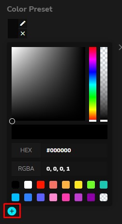
- Color Preset – You can choose any colors of your choice to display on front-end. As easy as clicking the “+” button then input the hex code or simply drag the color board.
-
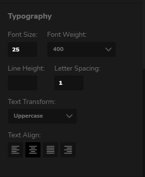
- Typography – This is where you can set the custom text’s font size, weight, line-height, letter spacing, text-transform, text align
-
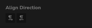
- Align Direction – This is another way to help you set your custom text in a better position just by selecting if the text will be aligned to left or right.
-
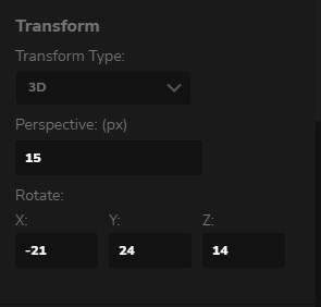
- Transform – You can never go wrong the transform type which gives the custom text a little bit more real where you can set your text into 2D or 3D position. There’s a lot of options for both type of positions.
-
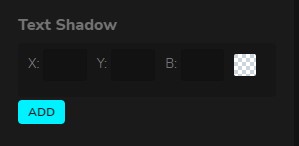
- Text Shadow – Also adding text shadow can turn your custom text into more creative styling.
-
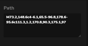
- Path – When creating custom text there are some designs that you want your text to be as alive or creative as possible but not overrated. Using svg path, the custom text will have a form of curve or any type of curve path. There is already generated svg path online, just copy it and paste it here:
-
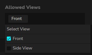
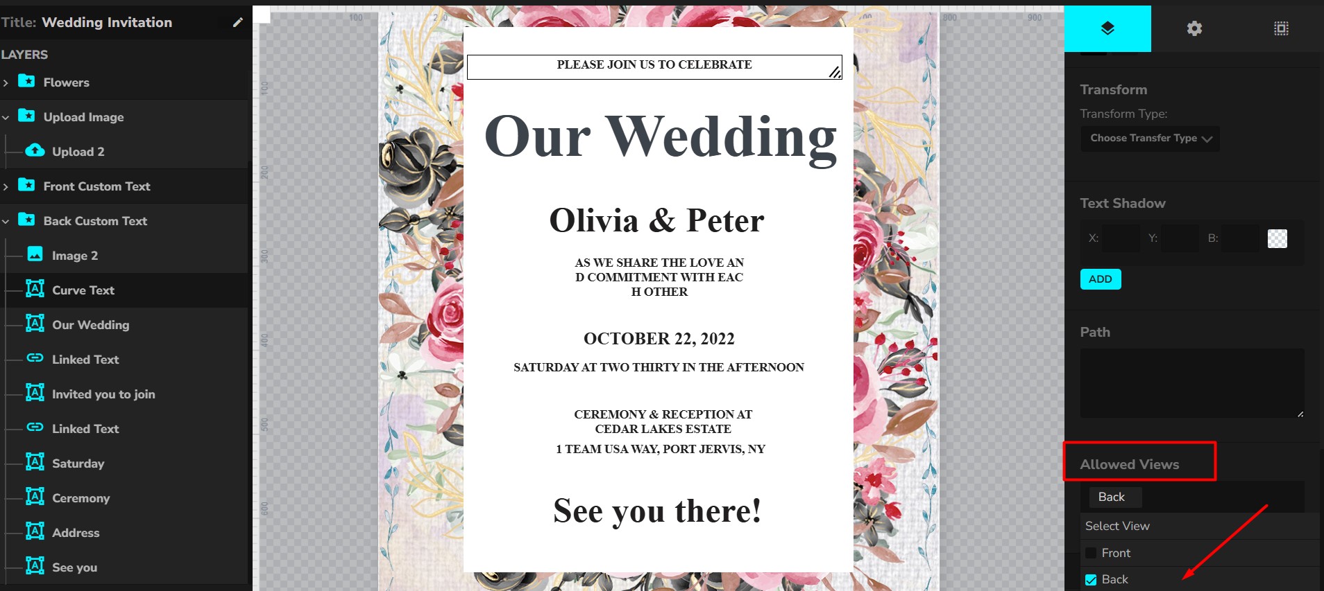
- Allowed Views – You can set your text where you want it to be display if you have 2 or more views. Also note that your added custom text will not display if the allowed view is not set.