When you activate the Vogue Skin for WP Configurator Pro, a dedicated settings panel appears under Configurator → Settings → Vogue Skin for WP Configurator Pro. Here you can customize the skin’s look and behavior to fit your brand and product experience.
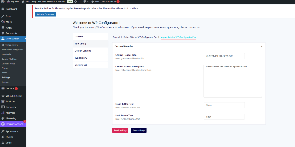
General Settings
In the General tab, you can adjust the main control panel behavior and labels.
- Control Header Title – Enter a custom title for the control panel header (e.g., CUSTOMISE YOUR VOGUE).
- Control Header Description – Add a short description or instructions that appear under the header (e.g., Choose from the range of options below.).
- Close Button Text – Customize the label for the close button (default: Close).
- Back Button Text – Customize the label for the back button (default: Back).
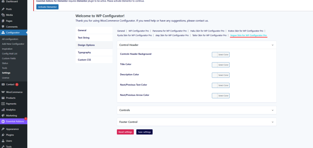
Text String Settings
This tab lets you personalize the wording of control labels and instructions.
- Control Header Background – Set a background color for the control header.
- Title Color – Choose the color for main titles inside the panel.
- Description Color – Select the text color for descriptions or instructions.
- Next/Previous Text Color – Define the color for navigation text (Next / Previous).
- Next/Previous Arrow Color – Define the arrow icon color for navigation buttons.
These options ensure your text elements stay on-brand and legible against your chosen panel colors.
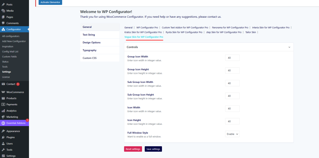
Design Options
The Design Options tab controls the sizing and layout of icons within Vogue’s interface.
- Group Icon Width & Height – Define the default size (in px) for main group icons.
- Sub Group Icon Width & Height – Define the size for sub-group icons.
- Icon Width & Height – Adjust the dimensions of general icons.
- Full Window Style – Toggle between standard panel mode and full-window style. Enabling this gives the user a fullscreen configuration experience.
Typography & Custom CSS
- Typography – Control fonts, weights, and sizes for text elements, matching your brand’s look.
- Custom CSS – Insert your own CSS code for advanced styling beyond the default options.